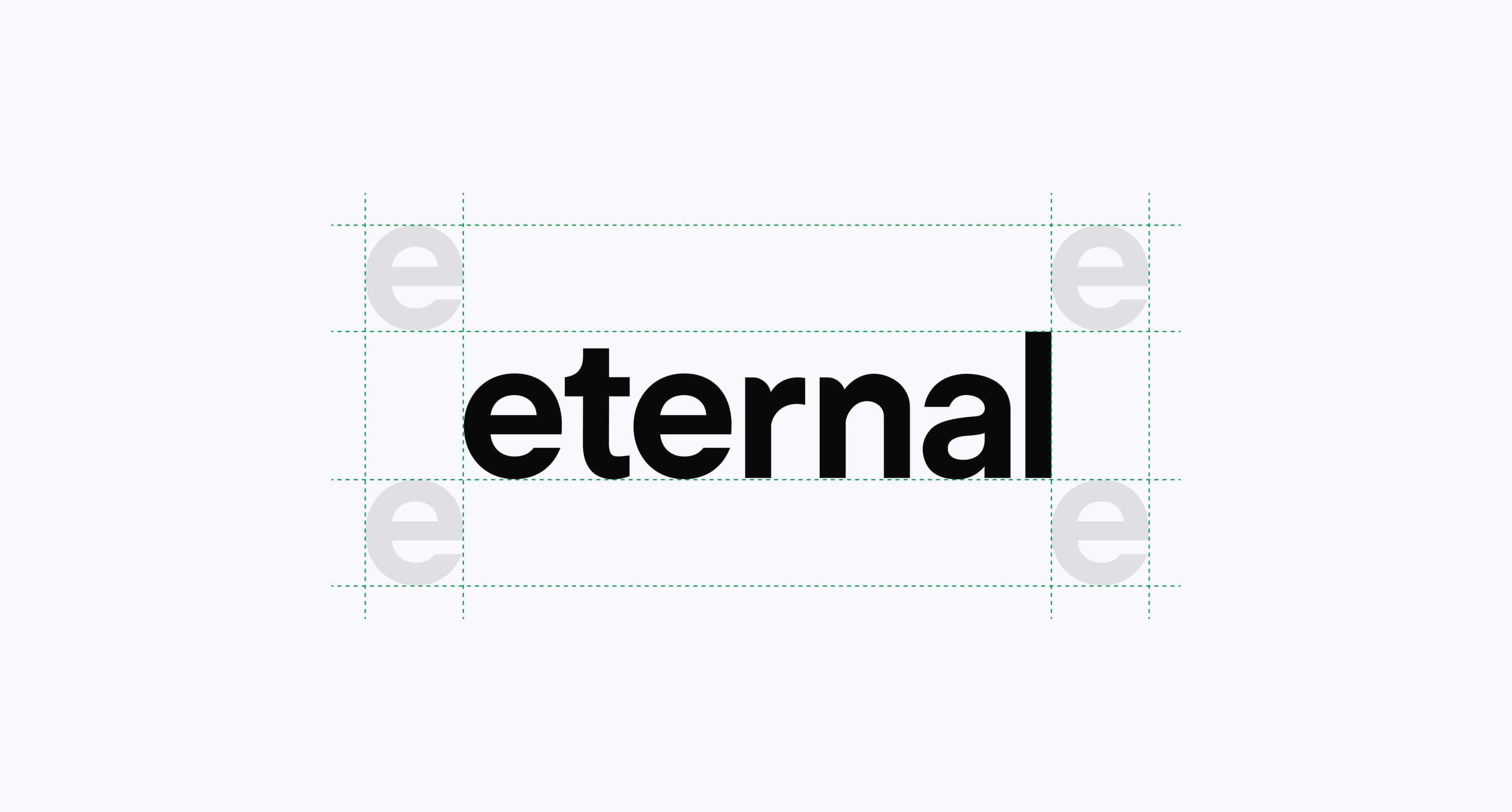
To ensure visual clarity, maintain clear space around the logo. No graphic, image, or text should intrude into this area.
The logo is our most important identity element. It appears in all of our communications, and we need to ensure that it’s presented in a clear and consistent way.
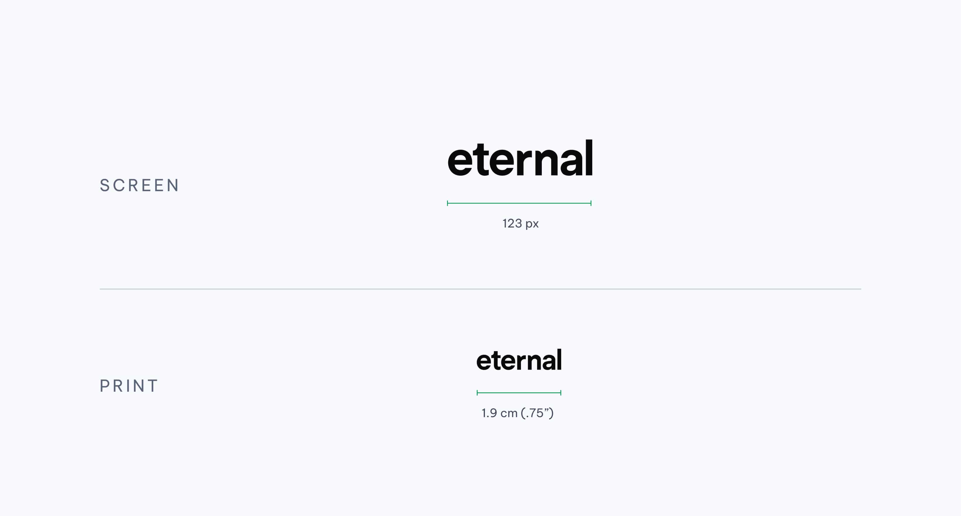
Always use the correct logo size for the visual placement (example: digital or print). If you require the logo in different sizes, be sure to scale the logo proportionally. Do not shrink or stretch the logo vertically or horizontally.
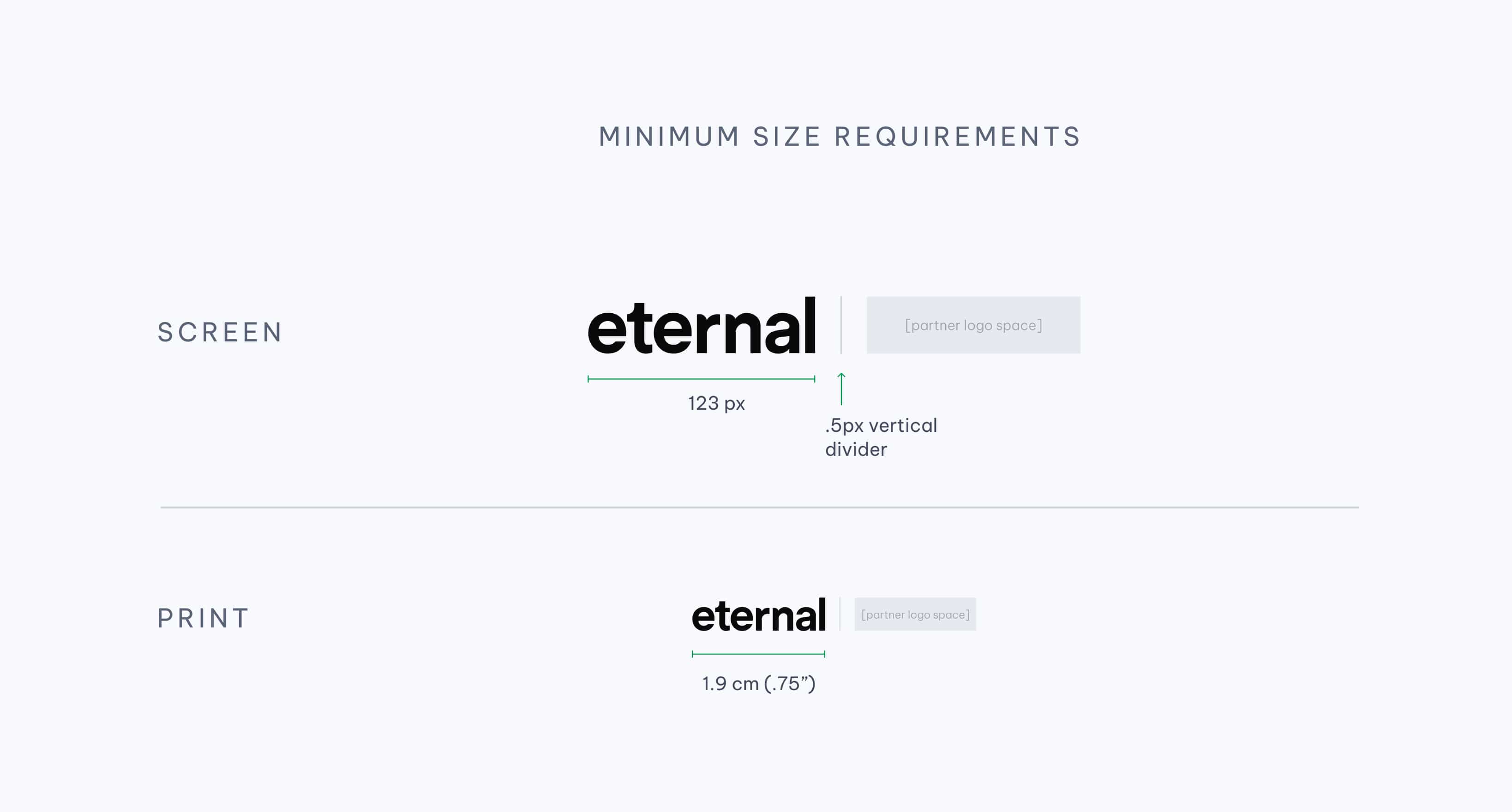
In co-branded scenarios, the partner logo appears on the right, separated by a vertical divider. Maintain equal visual weight and spacing to ensure clarity and balance.
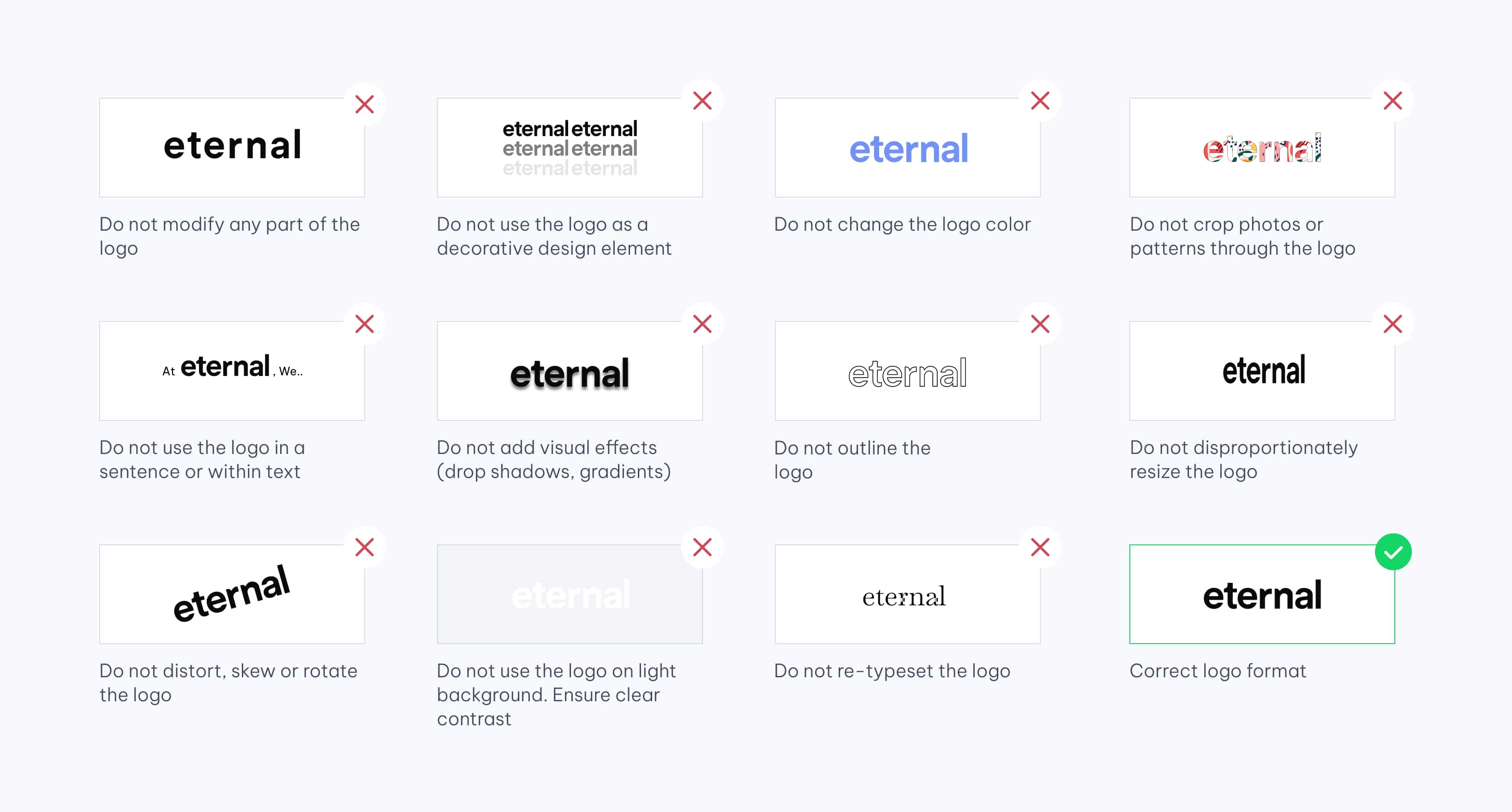
To maintain a strong visual identity and uphold the integrity of the Eternal brand, the logo must always be applied with care and intention.
Incorrect usage – such as distortion, improper colours, or cluttered backgrounds can weaken our presence.
Always follow the usage guidelines shown and refer back to the rules to ensure the logo is used with clarity, consistency, and respect.
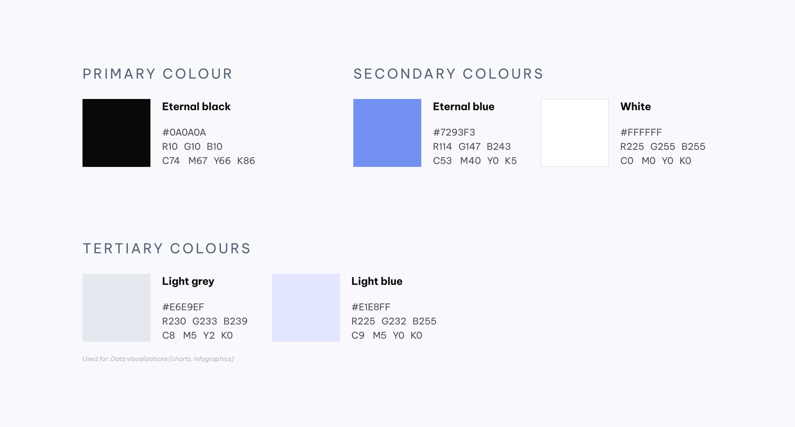
Primary and secondary colours focus on contrast and harmony, while tertiary tones add subtlety for charts and infographics.
Use Eternal Black and White for structure, Eternal Blue for highlights, and soft shades for visual balance.
Use colour with intention and restraint.
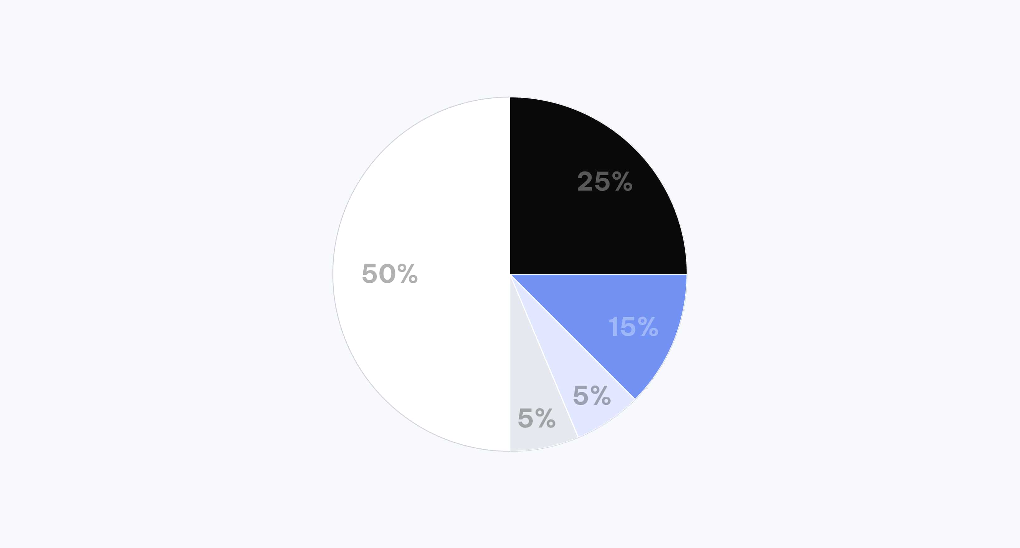
White dominates at 50% to maintain spaciousness, followed by 25% black for structure, 15% blue for emphasis, and 10% soft tones for gentle accents.
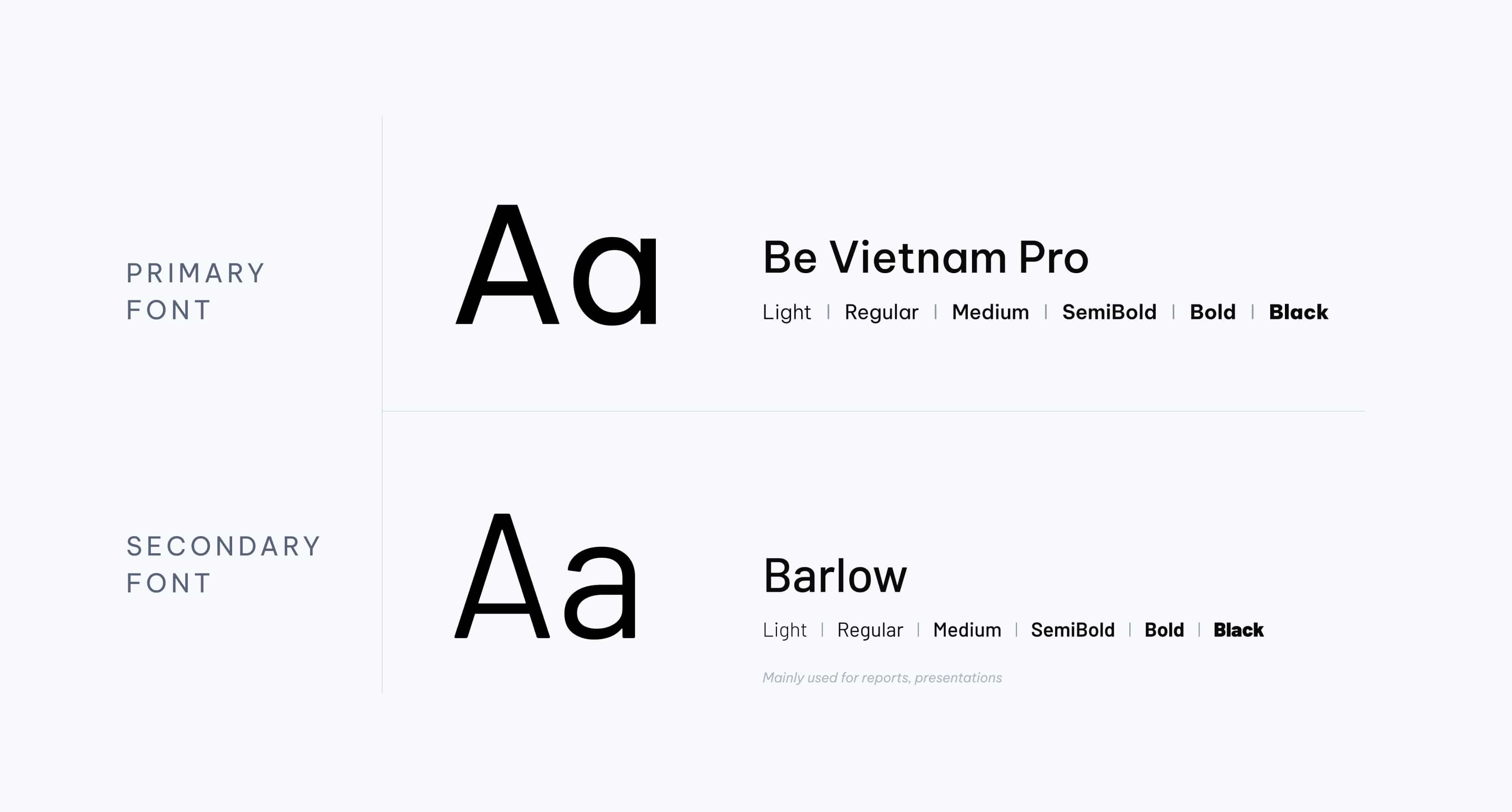
Be Vietnam Pro is the primary font used across all communication for its clean, modern structure. Barlow is the secondary typeface – mainly used for reports, presentations, and supporting materials where versatility and legibility matter most.